ADDO NOVO, INC.
MARKETING CAMPAIGN


Addo Novo, a Boston-based furniture studio, offers only the best in modern design. With so many knock-off products on the furniture market, they were searching for a way to emphasize the importance of purchasing licensed original designs. In collaboration with the Addo Novo founders, we created the "For Real" campaign: a slightly irreverent marketing push that poked fun at mid century knock-off culture.
LTHR SUPPLY
REBRANDING


LTHR, a small leather shop in Brighton, MA, creates durable, everyday goods and accessories for the urban consumer. Coming into their second year of business, they were ready to take their brand to the next level. We worked to reframe the LTHR brand into LTHR Supply by developing a new logo as well as new messaging for their website, press materials, and social media platform.
FOUNDRY TIMEPIECES
BRAND DEVELOPMENT


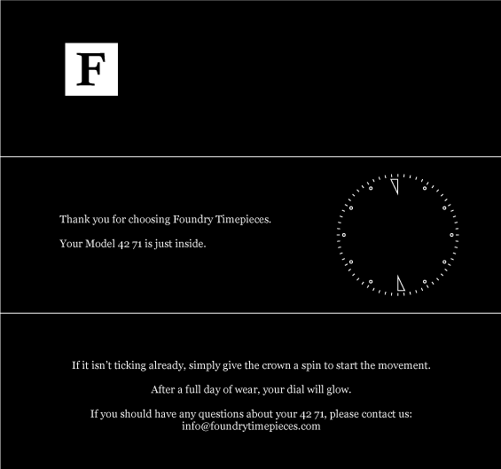
Foundry Timepieces, a Boston-based maker of heirloom quality watches, needed a platform for presenting their brand to the public. This included a logo, a tag-line and some basic teaser images to get the public's imagination going. Their "F" insignia as well as their tagline, "heirlooms of our time" were born as simple, impactful symbols of their brand.
RIVERSIDE FARM RESTAURANT & WINE MARKET
REBRANDING + WEBSITE DEVELOPMENT


Entering into its 25th year of business, Riverside Farm Restaurant & Wine Market was committed to making some major leaps with its online branding and the overall look and feel of its website. The final design exemplifies their simple, wholesome aesthetic and compliments the rusticated feel of their restaurant and specialty foods market. The redesign included a new logo for social media, an overhaul of the wireframe for their website and new web assets including a blog and a brand new tag line, "Simple, Wholesome Food and Drink Since 1990."
CLICK ALCHEMISTS
NAMING + LOGO DEVELOPMENT

Click Alchemists creates powerful, intuitive websites for businesses ranging from restaurants to hair stylists. With a penchant for witty, whimsical content and design —and an the ability to turn on a dime with lightspeed turnaround on deadlines— they wanted an equally clever logo that was punchy, memorable and to the point. A classic mouse pointer with an "A" silhouette did the trick.
DIGSBY
NAMING + BRANDING + WEBSITE DEVELOPMENT


With its beginnings in the start-up scene of Boston, Digsby was created to helps travelers find private spaces for peace, quiet, and collaboration.
Before starting their search for funding, Digsby wanted to flesh out a branding concept that fit their lighthearted, approachable vibe. We devised a simple, flat-design logo that is equal parts retro and recognizable. Their tagline, "find space in an unfamiliar place" is equally memorable. A single-page, introductory splash website was also created to introduce the company and its offerings.
KYLE ODDIS
REBRANDING


Kyle Oddis is a writer, editor, and poet based out of Boston. In launching her new website, she realized that branding herself appropriately was paramount in creating lasting impressions for clients. We developed a series of brand images for her website and marketing materials that are both straightforward, impactful and a perfect reflection of her personality.
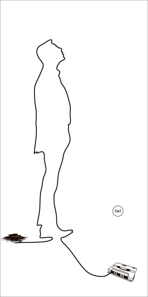
TENTH GATE PRODUCTIONS
LOGO DEVELOPMENT


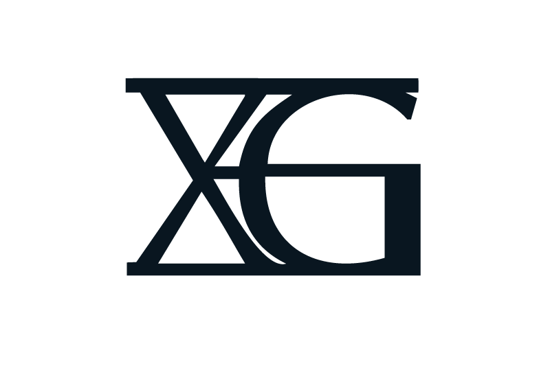
Tenth Gate is an independent film production house out of Los Angeles. After five years of producing shorts for clients and film festival distribution, they were ready to move away from the original "Tenth Gate Lion" logo design for something a bit more modern. The new logo needed to be scalable for use on business cards, posters, and marketing materials so we leveraged a play on roman numerals to create their new "XG" logo. A more masculine, uniform representation of the brand, its quickly recognizable and successfully brings the brand's overall look into the 21st century.
LOGO + ILLUSTRATION WORK
A series of self initiated logo and illustration designs.